|
|
|
|
|
|
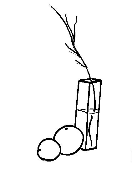
This still life has better composition. The objects are placed so that they are close together, and they overlap in an interesting way. You should place your objects so they are balanced well. See how the orange has been turned on the side? |
Back to Home
