Viewpoints
|| Set up
frame || Adding
line drawing || Putting
in colour || Adding
your labels || Arrows
or not? || Make
a heading
1.
Your first task is to
decide what viewpoint to use.
|

|
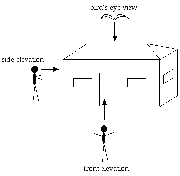
Look at this diagram, to
see what viewpoint you will be using. A bird's eye view is
usually essential, so you can see where everything goes.
If you are doing one of a
house, for example, you would draw it from the point of view
of a bird flying over the top, and pretend the roof wasn't
there.
Side views are often
called elevations. They show what something will look like
when you are standing in front of it, or beside
it.
|
2.
Now draw up a frame. If
you are doing it by hand, make sure you use a ruler. If you are doing
it on the computer, use a rectangle tool, rather than separate
straight lines. Make sure the corners are right angles, and all the
lines are straight. Don't forget to leave room for your title or
heading!
3.
Do your own line drawing
to fit in the frame. Use thin, neat lines, and draw as carefully as
you can.
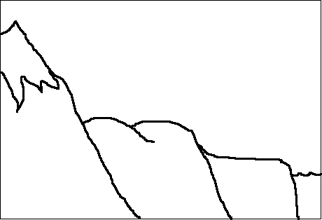
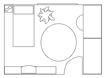
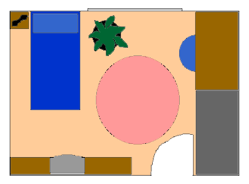
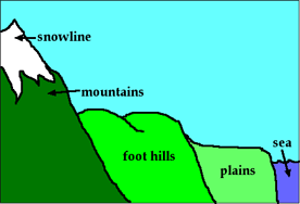
On the left is an example of a
side view, and the right hand diagram is a bird's eye view of a room.
4.
Now you can decide whether
or not to add colour. It may make your diagram look better, or it may
completely spoil it, so make the decision carefully.
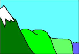
What do you think? The colour probably adds to the simple side view,
but is a bit confusing on the bird's eye view.
5.
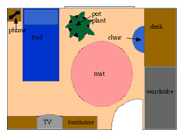
Neither of these diagrams
or plans are very clear yet - it is hard to see what they mean. We
need to add labels to explain what each item is. You can see that the
colour makes it a bit hard to read some of the labels on the right.
Always remember to keep your colours light so that you can read the
black writing. You can't read it if it is on top of a dark
background.
6.
Do you need to use arrows?
Look at the examples above. Where the label is on the top of the
item, an arrow pointing to it is silly. You only need to use arrows
if the object is small, and the writing is beside it.
7.
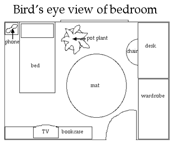
Now you should add your
title or heading. The plan or diagram is not finished until that is
there. On the left, there is room to put the heading in the big empty
space at the top, but usually you would put it across above the plan
or diagram, like the one on the right.
In the end, the best bird's eye
plan is the black and white one - the colour is confusing, and
doesn't help understand what things mean. But the coloured side view
is good, so we will stick to colour in that example.
Back to Top
